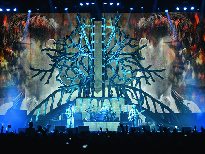
TPi’s current cover story goes backstage for Biffy Clyro’s latest tour. Kelly Murray chats to their Set Designer, Misty Buckley, about what her job in the creative aspects of touring entails…
How did you become involved in set design for touring productions?
I studied fashion design at Central St Martins and was more excited about designing and building the show at the end rather than the actual garments. I was hugely inspired by the storytelling and imagination of Alexander McQueen’s shows. But I needed more skills, so I studied technical drawing and model making for film in the evenings at Chelsea College, whilst I was in my third year. My tutor there was amazing and a huge support and she recommended me to a big time set designer called Bill Laslett. The day before my graduation, he asked me to assist him on an opera in Taormina, Sicily. It was mind blowing with mount Etna bubbling away in the background and the sun setting over the enormous set. The music started and I just felt overwhelmed by the power of live shows and the emotion and creative possibilities within that realm of design. I had found my perfect job!
Who have you designed for in the past?
My first ever live design was for P!NK for the Brit Awards and then I designed for Bat for Lashes, Take That, Anastacia and Glastonbury Festival. I am currently designing sets for Coldplay, Biffy Clyro and a few secrets…
How did you get the job designing for Biffy Clyro’s Opposites tour?
I was recommended to the band by Chris Vaughan. We have worked on some really interesting projects together. I have worked with the band before on their Revolutions tour and I absolutely love how creative they are. They have a lot of respect for the creatives around them and it makes a huge difference to your confidence in pushing the boundaries and designing something that would be unconventional for an arena tour. It is a very empowering environment when artists are happy for you to suggest and push unusual ideas. I think they are brave.
What kind of creative ideas were thrown around at the concept stage? Did the band have clear ideas?
The album was an incredibly personal journey for the band… They were going through stuff. This was so apparent in our conversations and the lyrics of the material. I felt it was really about growing and change and their relationships with each other. The words which were thrown around a lot were “organic”, “growing” and “human spirit”. The front cover of the album is a twist on a tree… A symbol of growth. I took it one step further and suggested the we look at personal growth and the interior of the person. We revealed the heart and soul of the band with a sculptural representation of Da Vinci’s anatomical drawings…. The set was made to look like human bone and muscle and the huge video screen served as an incredible tool to tell stories about the evolution so apparent in the album and ultimately in the show.
How long did the final design take?
It came very quickly once we were on a roll. The band were really on-board with the early ideas and then they gave me a free reign to design and realise the set.
How would you describe working on this project as a whole?
I love working with Biffy Clyro. Having done two tours and some festival sets for them, I feel like I have seen them embrace change and new concepts. They are experimental and excited, which is quite rare in a band who has been established for some time. The project was incredibly tight time wise, but all the suppliers worked so hard to make it happen and the results were pretty thrilling… When Simon [Neil, lead vocalist] opens with Different People and the arteries all light up and the screen graphics grow out from the behind the centre of the vertebrae, you can feel the electricity and music run through you. As if you are at the beginning of a very special journey or special night out at least!
TPi
www.mistybuckley.co.uk


